borNauthentiC
Identity
Identity
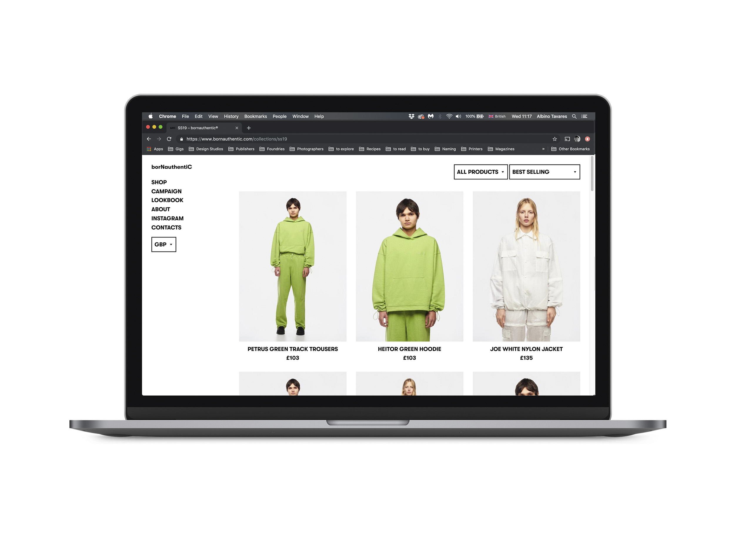
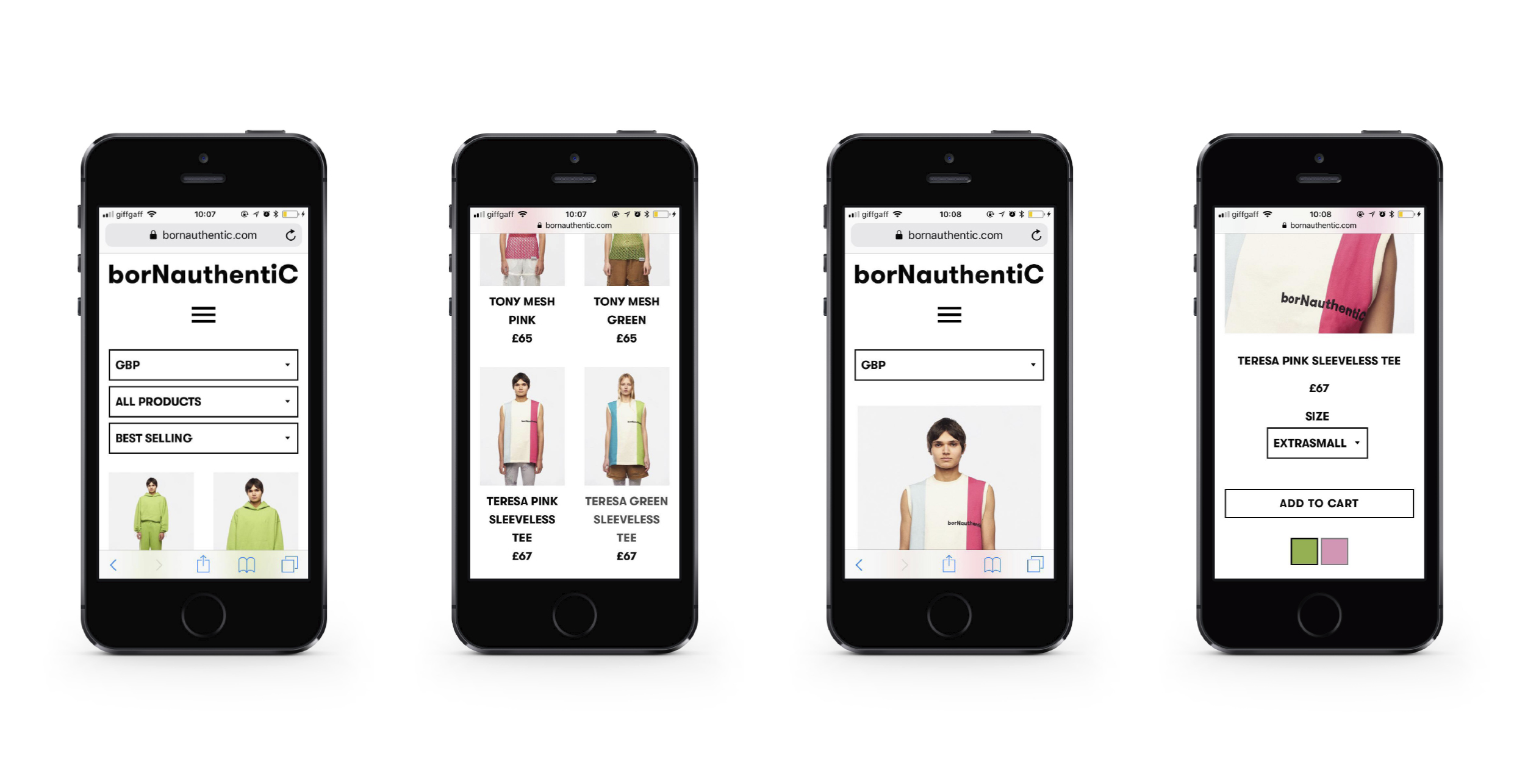
The visual identity for the clothing brand Born Authentic was developed with a focus on typography as the primary carrier of meaning. A strong yet elegant typeface was selected to function consistently across different contexts — as a logotype, within the website, and applied directly to garments — maintaining a contemporary, urban character.
Rather than relying on conventional capitalisation, the brand name was reconfigured as borNauthentiC. The decision to capitalise the final letters instead of the initial ones introduces a subtle narrative of birth and growth, beginning in lowercase and culminating in uppercase. This typographic shift reinforces ideas of emergence, development and self-definition, while simultaneously making the wordmark visually distinctive.
The words were intentionally treated as a single unit, reflecting how the brand name is commonly spoken and perceived as one continuous word. This linguistic observation was formalised through typography, strengthening the sense of authenticity by aligning visual form with everyday use.
A shortened version of the identity, bNC, was also developed for applications requiring reduced scale, such as social media profile images and selected products. This abbreviation continues the focus on the final letters of each word, ensuring conceptual and visual consistency across the system.
The resulting identity is minimal yet expressive, allowing the typography to adapt fluidly across digital platforms and physical garments, while maintaining a clear and recognisable presence.
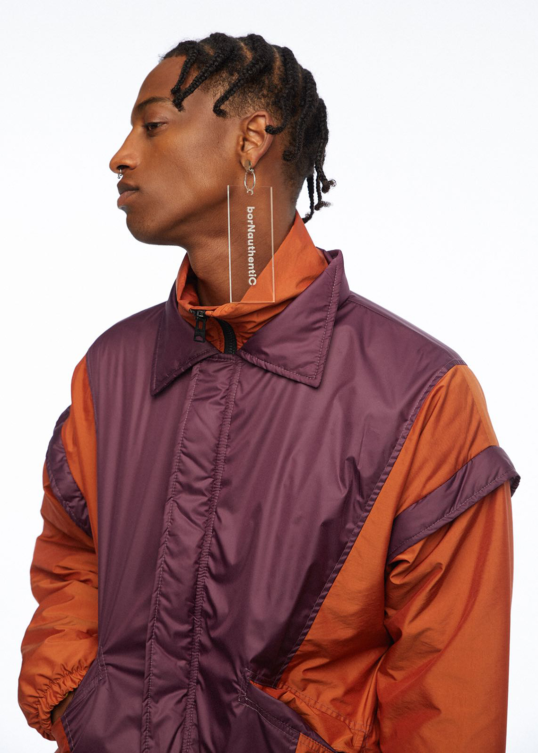
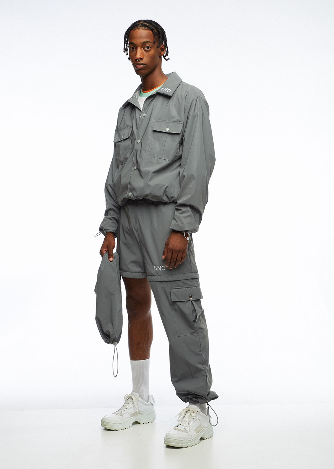
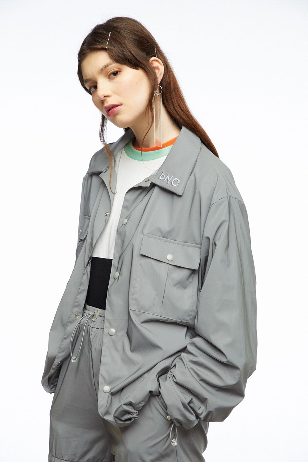
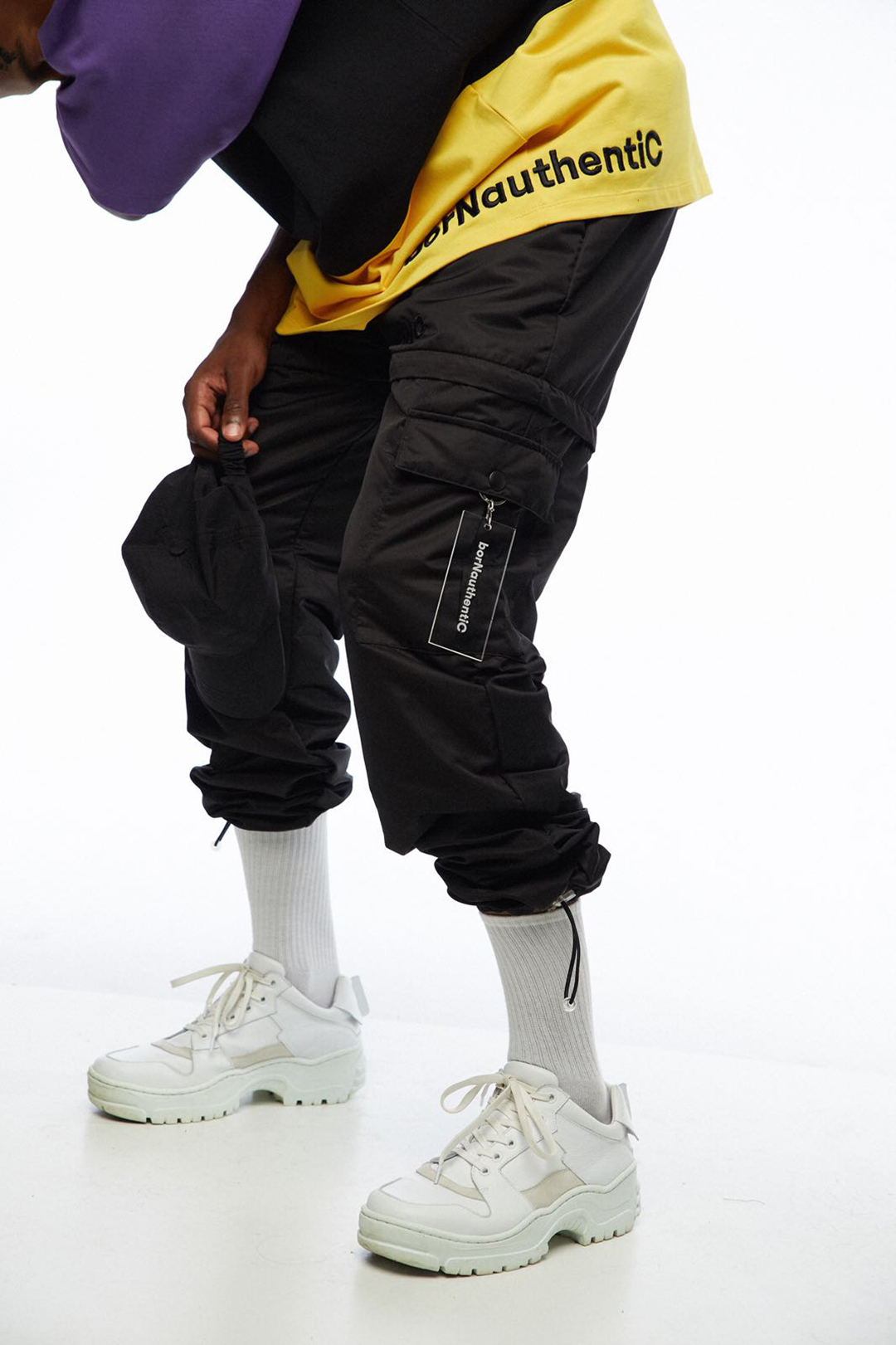
Images from borNauthentiC AW18 collection

Designed with João Alves Marrucho
2018
2018